
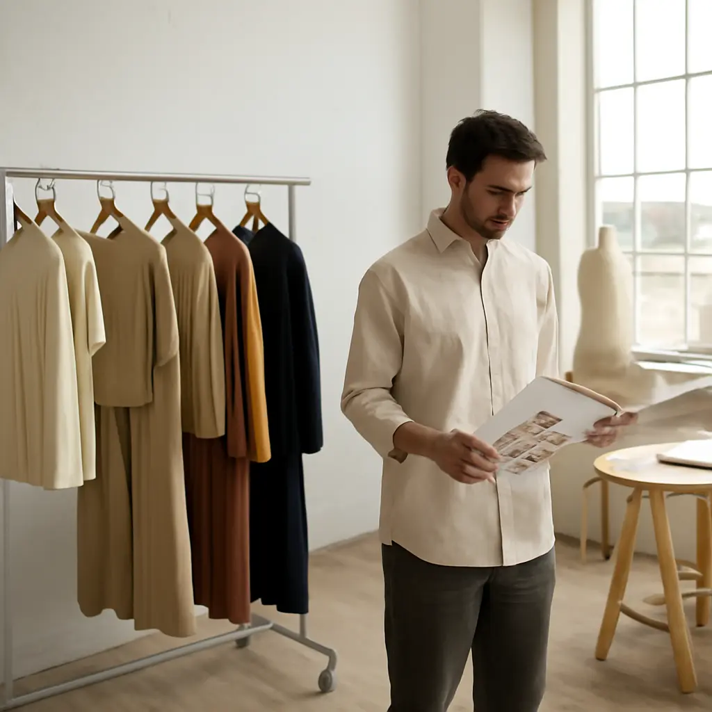
A fashion lookbook is a curated visual presentation of a designer’s collection, created to communicate its identity, styling, and intended audience to buyers, editors, and customers. Emerging designers often weaken that presentation by treating it as a set of attractive photos rather than a clear, usable fashion communication tool. The most damaging mistakes include an unclear concept, inconsistent imagery, poor garment visibility, weak styling and casting decisions, incomplete production details, and distribution that misses the intended audience. These errors matter in a crowded market: the McKinsey Global Fashion Index has estimated that the fashion industry generates roughly 2% of global GDP, while the British Fashion Council has documented fashion’s substantial economic and employment contribution in the UK. A lookbook cannot guarantee coverage or sales, but it can make a collection easier to understand, assess, and remember.
Lookbook strategy: the purpose and audience of an emerging designer’s lookbook
A lookbook is a collection-focused visual document: it presents garments through photographs, styling, sequencing, and concise supporting information. Its job differs from a campaign, which typically sells a mood or brand story, and from a line sheet, which supplies the practical product and wholesale information buyers need. The Council of Fashion Designers of America’s professional resources and fashion-industry practice both reflect this distinction: presentation materials must serve the intended business conversation, not merely look polished.
Before production, define who will use the lookbook and what they should do next. A buyer may need to understand the range and identify products; a magazine editor may need a strong visual story and usable credits; a customer may need inspiration and a direct route to shop. One document can support several audiences, but its priorities should remain clear.
Mistake: treating every lookbook as a campaign
A campaign image can be intentionally ambiguous, atmospheric, or cropped. A trade-facing lookbook also needs to show what is being offered. When dramatic lighting, props, or abstract poses conceal a garment’s shape, color, construction, or fit, the image may be memorable but commercially unhelpful. Use expressive photography where it strengthens the collection’s point of view, then balance it with clear views of each important look.
Mistake: designing for an imaginary audience
Audience definition is the practical link between creative choices and distribution. A wholesale buyer, for example, needs to compare products efficiently, while a press contact may first need a compelling editorial narrative. If the designer does not identify the primary audience, the result often mixes sales copy, editorial imagery, and incomplete product data without serving any of them well. Write a one-sentence brief stating the audience, the collection’s central idea, and the action the reader should take.
Visual storytelling: how lookbook concepts and imagery communicate a collection
Visual storytelling is the intentional use of photography, styling, casting, location, and sequence to express a collection’s identity. A coherent lookbook does not require every image to look identical; it requires creative variation to feel connected to a recognizable idea. That connection helps viewers interpret individual garments as part of a designed range rather than a random assortment.
The concept should emerge from the clothes, not overpower them. A useful test is whether a viewer can describe both the collection’s mood and its wearable products after looking through the images. If the answer is only “interesting photography,” the storytelling has displaced the fashion.
Mistake: building a vague or disconnected concept
A concept is the organizing idea that gives the images a shared visual and emotional direction. “Modern,” “bold,” and “luxurious” are too broad to guide a shoot unless they are translated into concrete choices—such as a defined color palette, setting, lighting approach, and styling rule. Disconnected locations, conflicting references, or unrelated image treatments make a collection harder to read. Create a mood board and a short visual brief before booking a team, then check every proposed image against them.
Mistake: letting styling hide the product
Styling is the arrangement of clothing and accessories on a model; it should clarify how pieces relate while preserving the garment’s design. Over-layering, distracting accessories, excessive movement, or poses that hide seams and closures can obscure the very details buyers are assessing. Photograph statement styling when it supports the story, but include straightforward views that show silhouette, construction, and how each look is worn.
Mistake: overlooking casting and representation
Casting determines whose bodies and identities represent the collection. A narrow or inconsistent casting approach can make a brand appear disconnected from its intended customers, while a mismatch between garment design and model fit can make proportions difficult to evaluate. The U.S. Census Bureau’s population data and the fashion industry’s ongoing discussions of representation offer a reminder that audiences are not one-size-fits-all. Choose models thoughtfully, show garments on bodies that suit the brand’s audience and sizing strategy, and ensure the casting feels deliberate rather than tokenistic.
Product presentation: how lookbook photography and information support evaluation
Product presentation is the accurate, consistent communication of a garment’s appearance and relevant details. In a lookbook, photography and information work together: images create interest, while captions and product references help readers identify what they are seeing. This is particularly important when a lookbook is used alongside a line sheet or sales appointment materials.
The National Retail Federation’s reporting on retail and consumer behavior underscores the importance of product information in shopping decisions, although online shopping research should not be treated as a direct measure of lookbook performance. For designers, the practical lesson is straightforward: make visual claims credible and product details easy to verify.
Mistake: using images that do not show garments accurately
Accurate product imagery preserves the garment’s true color, proportion, texture, and construction as far as the medium allows. Heavy color grading, underexposure, motion blur, and inconsistent retouching can make pieces appear different from the samples buyers later receive. Use consistent lighting and color management, review images against the physical garments, and include front, back, and detail views where those angles help explain a design.
Mistake: omitting product identifiers and practical details
Product identifiers connect a photograph to an orderable item. Without a style name or number, color, material, or a clear cross-reference to a line sheet, a reader may like a piece but struggle to request it. Include concise captions or a product index with stable style codes, season, colorways, and relevant fabric information. Where prices, sizes, or delivery dates may change, keep those details in a separate, updateable line sheet rather than allowing outdated information to circulate in the lookbook.
Mistake: showing too few or too many looks
A collection edit is the deliberate selection and ordering of looks. Too few images can leave important categories or the collection’s range unexplained; too many can bury the strongest pieces and exhaust the reader. There is no universal ideal number: the right edit depends on the size of the range, the audience, and whether the document is digital or printed. Prioritize hero looks, representative product categories, and images that add new information rather than repeating the same silhouette.
Lookbook design and production: how layout affects usability
Lookbook design is the arrangement of images, text, and navigation into a document that is legible and easy to use. A strong visual identity can coexist with practical design: clear sequencing, readable typography, consistent spacing, and sensible file preparation. The format should support the reader’s task on a phone, laptop, or printed page.
Digital documents are often forwarded, opened on different devices, and viewed under time pressure. The Web Content Accessibility Guidelines, published by the World Wide Web Consortium, recommend sufficient text contrast and meaningful alternatives for images in digital content. While a lookbook is not necessarily a website, accessible design principles can make its contents easier to read and navigate.
Mistake: prioritizing decoration over navigation
Navigation is the set of cues that helps readers find and understand content. Oversized decorative typography, low-contrast text, inconsistent page structures, or unexplained jumps between looks can frustrate readers. Use a clear opening, a logical sequence, page numbers or section labels where useful, and typography that remains legible at common screen sizes. Add image descriptions in digital files when the format supports them.
Mistake: ignoring file performance and technical quality
A digital lookbook should balance image quality with manageable file size. An excessively large PDF may be slow to download or difficult to email, while aggressive compression can damage image detail. Export a screen-friendly version, test it on mobile and desktop, check links and fonts, and keep a high-resolution version for print or specific production needs. Use descriptive file names and verify that the final document opens correctly before distribution.
Mistake: treating accessibility as an afterthought
Accessibility means making information usable by people with different abilities, devices, and viewing conditions. Low contrast, tiny captions, text embedded only in images, and an untagged PDF can create avoidable barriers. Apply readable contrast and type sizes, use descriptive image text where possible, and structure digital documents so assistive technologies can interpret them. These choices also improve usability for readers who are viewing the lookbook on a small screen or in poor lighting.
Lookbook distribution: how emerging designers reach buyers, editors, and customers
Distribution is the process of delivering the lookbook to the right people through an appropriate channel and supporting the next step. A carefully produced document has limited value if the intended audience cannot find it, cannot open it, or receives it without enough context. The channel should match the purpose: a direct, personalized email for a buyer or editor; a press resource page for media; or a public digital version for customers.
The U.S. Small Business Administration advises businesses to define their target market and use that understanding to guide marketing decisions. For a designer, this means building a focused contact list and a clear follow-up plan instead of sending a generic attachment to every address available.
Mistake: sending the same document to every contact
Audience-specific distribution adapts the message, not necessarily the entire collection. A buyer may need wholesale context and a line-sheet link; a stylist may need garment availability, credits, and loan details; a customer may need a shop link and accessible product descriptions. Make the intended next step obvious, and avoid including confidential wholesale information in a public-facing file.
Mistake: forgetting image credits, contact details, and follow-up
Credits identify the people and businesses involved in producing the images, while contact details make it possible to request products, interviews, or further information. Missing photographer, model, hair, makeup, and styling credits can create professional and rights-management problems. Confirm permissions and usage terms with the creative team, credit contributors accurately, provide a monitored contact address, and follow up courteously with relevant information rather than repeatedly sending the same file.
Mistake: failing to measure whether the lookbook works
Evaluation is the review of whether a lookbook supports its intended business outcome. Track practical indicators such as relevant replies, buyer requests, press inquiries, product-page visits, or appointments attributed to the distribution. These measures do not prove that the lookbook alone caused a result, but they help identify whether the audience, content, and call to action need adjustment. Ask a small group of intended readers to locate a specific garment and explain the collection before launch; their feedback can reveal confusing labels or missing information.
Conclusion: a useful lookbook makes a collection clear and memorable
The biggest lookbook mistakes are failures of communication: unclear audience and concept, imagery that hides the product, incomplete details, difficult layout, and poorly targeted distribution. Emerging designers can avoid them by treating the lookbook as both a visual story and a practical tool. Define its audience, make creative choices serve the collection, verify product information and image rights, test the file across devices, and give each reader a clear next step. Before publishing, ask a buyer, editor, or customer from the intended audience to review it. Their questions will show where the lookbook needs to be clearer—and help turn a polished presentation into a more effective professional resource.
Sources: McKinsey & Company, The State of Fashion 2024, https://www.mckinsey.com/industries/retail/our-insights/state-of-fashion; British Fashion Council, Fashion’s Economic Contribution, https://www.britishfashioncouncil.co.uk/; Council of Fashion Designers of America, Education and Career Resources, https://cfda.com/resources; U.S. Census Bureau, QuickFacts, https://www.census.gov/quickfacts/; National Retail Federation, Research and Insights, https://nrf.com/research; World Wide Web Consortium, Web Content Accessibility Guidelines (WCAG) 2.2, https://www.w3.org/TR/WCAG22/; U.S. Small Business Administration, Marketing and Sales, https://www.sba.gov/business-guide/manage-your-business/marketing-sales